In 2013, when the Guardian was still printed on the mid-sized Berliner format (smaller than broadsheet, but larger than tabloid), this story ran across a double-page spread.

I stumbled on it recently while working through images on this website, now that the site has been overhauled1. In case you can’t read the subtitle in that image, it reads:
David and Caro Fickling and their grown-up sons and daughter staked everything on their dream, a new weekly comic for kids. Living and working together can be tough. Interview by John-Paul Flintoff and art by Adam Murphy.
***
This was the first piece of journalism I wrote specifically to be illustrated. But I should rephrase that, to be more precise.
Writing for magazines, I had learned long before (sometimes the hard way) that stories might not be published at all if they couldn’t be made to look good with some kind of imagery – usually photos.
Commissioning editors had said to me a thousand times, “Yeah, great story, but what will we use for pictures…?” As an editor I had said it myself to other writers.
Illustrating this “Family Saga In Comic Form” was different. The words weren’t an addition but would themselves become images. I’m writing this post, nine years later, to reflect on how that happened.
Some of the background to the story comes across in the comic itself. To read it, just click on the (now) higher-resolution pictures:
At that time, my daughter was an avid reader of the weekly comic, The Phoenix. I took her one weekend to a comics festival the publishers organised in Oxford.
There I met Adam Murphy. He was running a workshop, teaching children to write and draw a comic of their own in page of A4 divided into 12 panels. It’s a terrific discipline for storytelling, but of course he didn’t need to tell them that because they regarded it as straightforwardly thrilling and funny.
So did I. I was a fan of Adam’s weekly “Corpse Talk” series, in which a cartoon version of Adam hosted of a chat show featuring eminent dead people. I joined the workshop, and made my own one-page comic.
The Fickling family were there too. It occurred to me that a story about how they put the comic together every week might be good for the Guardian’s Family section.
I suggested it to the editor (full disclosure: my wife), and got the go-ahead.
I fully intended to write the interview up as usual, in prose, to be “illustrated” with some kind of family photo.
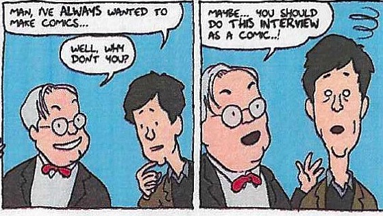
But as I was doing the interview with David Fickling I found myself coming up with the idea of doing it as a comic.
And he said, Why don’t you?

I was thrilled by the idea. Not having published any illustrations of my own, at that time, I asked Adam to collaborate with me. After all, he already knew the Ficklings.
***
Initially, I was stumped. How to proceed? I couldn’t write the words until I knew what the pictures were, and Adam couldn’t draw the pictures until he knew the storyline.
As so often, the solution was simple: just get started.
So I wrote something like a script for the speech bubbles, with “stage directions” of the kind you tend to read in square boxes at the top of individual panels.
Adam quickly came back to me with a rough pencil sketch that eliminated many unnecessary words and introduced cinematic ideas to change pace, move backwards and forwards in time, and bring in new characters.
Looking back now, I see many ingenious things Adam came up with that might easily escape notice by somebody gulping the story down:
1. He created what film-makers might call “establishing shots”, showing Oxford from a distance, then a close-up of the Ficklings’ house, before “going inside”.
2. He used the five-panel grid to introduce the five family members, and in the manner of comics he gave each one a recognisable type, starting with David (‘The Visionary’).

3. He had the brilliant idea (obvious only with hindsight) of drawing the journalist (me) talking to the Ficklings inside their home – though in reality I had spoken to them individually on the phone.
4. Then he brought my daughter into the same house, plus my wife, then David Fickling’s own parents and David as a boy, several well known authors, and crowds of children.
5. To vary the pace, he broke the tyranny of the five-panel grid here and there by combining two panels into one; and he played with the notion of the grid itself by having tears shed in one panel leak into the panel beside it.
6. He injected emotional temperature by using (for instance) sunshine-yellow for the advent of a new comic, and black for the period of David’s “mourning” when that comic shut down.
7. He gave Caro Fickling two heads in one panel, and a speech bubble outlined by dashes to convey the muttered subtext behind her actual dialogue.
8. He allowed characters to speak to each other and to break the “fourth wall” by speaking directly to viewers/readers.
Some of these ideas may possibly have come from me. I don’t remember. But Adam was doing them week in, week out, and if I had the idea I had probably nicked it from him. I don’t think I’m being unduly modest if I give him all the credit.
I learned a lot from Adam, and remain immensely grateful – to him and the Ficklings too.
***
1 Overhauled. The excellent Julian has made it possible for me to display images, galleries, and sliders.
2 Corpse Talk. Available now in several collections, including this one about storytellers.

