I’m making little square logos to sit next to the feeds on my blogroll. Here’s where I’ve got to.
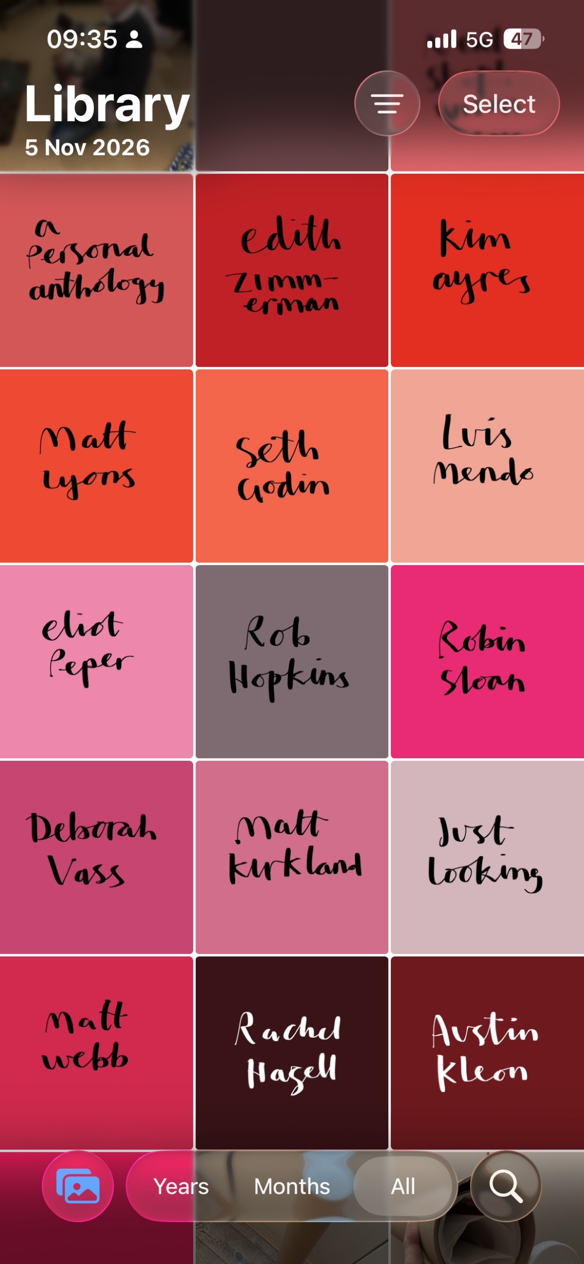
Fifteen squares, each with a name hand-lettered in black brush pen on a block of colour.
The palette runs warm. Dusty rose, brick and tomato reds, coral, pale salmon. Then into the pinks: a muted mauve-grey, magenta, berry, a pale lilac-pink, crimson. And finally deep oxblood and a near-black burgundy.
On those two darkest tiles, Rachel Hazell and Austin Kleon, the lettering switches to white.
Reading across the rows: A Personal Anthology, Edith Zimmerman, Kim Ayres. Matt Lyons, Seth Godin, Luis Mendo. Eliot Peper, Rob Hopkins, Robin Sloan. Deborah Vass, Matt Kirkland, Just Looking. Matt Webb, Rachel Hazell, Austin Kleon.
The lettering is a brush script with strong contrast between thick and thin strokes. Mostly lowercase, with the odd capital – Rob, Robin, Deborah, Luis, Rachel, Austin. Each name sits on two lines, roughly centred, with plenty of space around it.
Edith Zimmerman is the one that breaks across a hyphen – Zimm-erman. It has a handmade feel I like, but it stands out from the rest.
Pros
As a set they hang together. One hand, one family of colours, so the blogroll should read as a single piece rather than a jumble of other people’s logos.
Cons
How they’ll look at the size they’ll be shown. The thin strokes and the paler tiles – Luis Mendo, Just Looking – may lose contrast when they’re shrunk to 40 or 60 pixels.
That’s the next test.